Mobile First
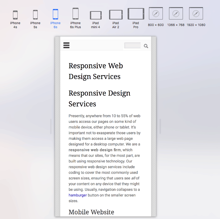
Presently, anywhere from 10 to 55% of web users access our pages on mobile devices, either phone or tablet. It’s important not to frustrate those users by making them access a large web page designed for a desktop computer. Our websites are responsive, built using responsive technology to improve user experience. Our responsive web services include coding to cover the most commonly used screen sizes, ensuring that users see all of your content on any device that they might be using. Usually, navigation collapses to a hamburger button on the smaller screen sizes.
Mobile Website Design Services
Our web services include the use of widgets and plugins to show interactive media (e.g. video) sized for the portal size of the device used (to enhance your digital marketing). After all, your responsive design is in competition with social media and has to look good and function well on small devices. Our goal is to keep your users on-site as long as possible. Case studies show that users are less likely to bounce from a site that is responsive, increasing on-site time and pages per visit. When these metrics increase, Google is likely to view your site as more relevant, which boosts search engine position as well. Google is now weighting the factor of mobile-friendliness when ranking pages, which is an important reason to use a responsive web design agency.